A microsite that transforms overwhelming content into an immersive browsing experience, showcasing all 63 national participants.
Are
Are
you
you
ready?
ready?

STAKEHOLDER
STAKEHOLDER
La Biennale di Venezia
ROLE
Visual Strategist + UX Designer
Visual Strategist + UX Designer
TOOLS
TOOLS
Figma + Adobe AE
Figma + Adobe AE
Figma + Adobe AE
SPAN
SPAN
± 4 Weeks
± 4 Weeks
± 4 Weeks
Inside Biennale Architettura 2023
Full Walkthrough of Biennale Architettura
Full Walkthrough of Biennale Architettura
Full Walkthrough of Biennale Architettura
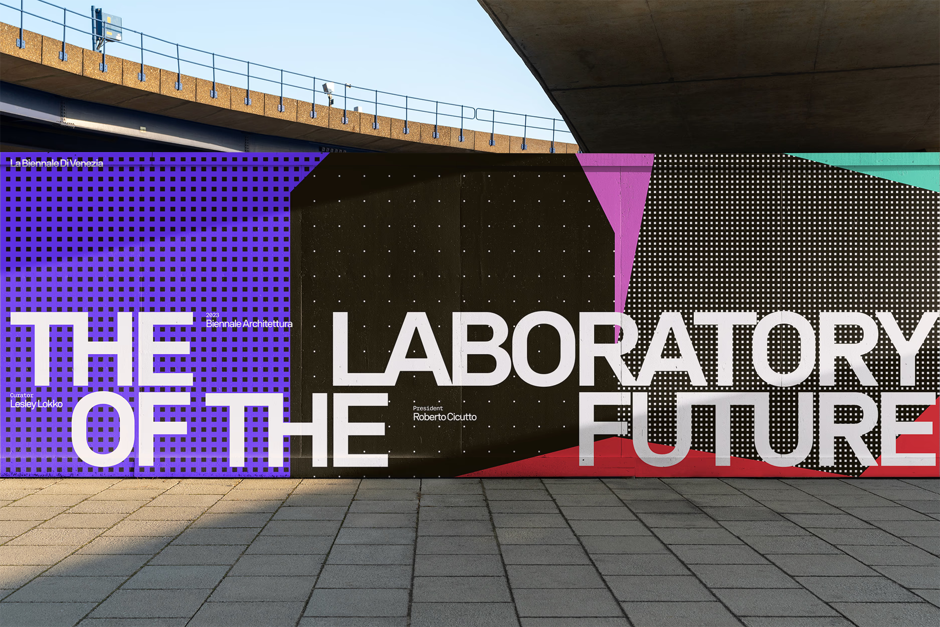
Capturing the Visual Essence of Biennale Architettura
Biennale Architettura is a global stage for architectural innovation, weaving together diverse cultural and social narratives. The exhibition is not a single story but a mosaic of perspectives, reflecting the complex and ever-evolving nature of contemporary architecture.
Inspired by fragmentation and fluidity, the microsite’s artistic direction embodies the richness of Biennale Architettura’s vision. As curator Lesley Lokko described:
“The Biennale is not a single story, but multiple stories that reflect the vexing kaleidoscope of ideas.”
Our goal was to translate this philosophy into an interactive digital experience, balancing structure with creative exploration.

Print Work for Biennale Architettura 2023
Biennale Architettura is a global stage for architectural innovation, weaving together diverse cultural and social narratives. The exhibition is not a single story but a mosaic of perspectives, reflecting the complex and ever-evolving nature of contemporary architecture.
Inspired by fragmentation and fluidity, the microsite’s artistic direction embodies the richness of Biennale Architettura’s vision. As curator Lesley Lokko described:
“The Biennale is not a single story, but multiple stories that reflect the vexing kaleidoscope of ideas.”
Our goal was to translate this philosophy into an interactive digital experience, balancing structure with creative exploration.
Print Work for Biennale Architettura 2023
Designing an Infinite Browsing Experience
With 63 national participants, the microsite needed to highlight both depth and diversity without overwhelming visitors. Instead of expecting users to browse every page, the experience was designed to feel infinite and slightly chaotic, mirroring the richness of the exhibition itself.
Upon landing, visitors are introduced to a dynamic index-style grid layout, which:
Organizes a vast amount of content in an intuitive way.
Retains crucial navigation elements for seamless exploration.
Uses a scroll-based transition where introductory content fades out, keeping the focus on discovery.
This structured overload keeps visitors engaged while allowing for intuitive navigation.
Exploring All 63 National Participants
Upon landing on the microsite, visitors encounter a list of all 63 national participants, organized within a grid-based index that effectively manages a large volume of content. As they scroll, the initial Biennale Architettura introduction fades, keeping the focus on exploration, while crucial navigation elements remain anchored to ensure accessibility. The modular grid layout reinforces a structured yet organic browsing experience, allowing for intuitive interaction. By balancing abundance with usability, we created a system that engages visitors without overwhelming them, maintaining the richness of the exhibition while ensuring seamless navigation.

Landing on the Index Page
Upon landing on the microsite, visitors encounter a list of all 63 national participants, organized within a grid-based index that effectively manages a large volume of content. As they scroll, the initial Biennale Architettura introduction fades, keeping the focus on exploration, while crucial navigation elements remain anchored to ensure accessibility. The modular grid layout reinforces a structured yet organic browsing experience, allowing for intuitive interaction. By balancing abundance with usability, we created a system that engages visitors without overwhelming them, maintaining the richness of the exhibition while ensuring seamless navigation.
Landing on the Index Page
Managing Information Overload
To help visitors navigate the vast amount of content, we introduced a filtering system that allows users to refine their search by location, ensuring a more tailored experience based on their interests. This structured approach reduces cognitive overload by breaking down information into manageable sections, empowers users to control their own exploration, and maintains the immersive nature of the exhibition while preventing frustration. By fine-tuning searches and keeping the navigation intuitive, we created a system that respects user autonomy while preserving the Biennale’s spirit of discovery.

Filter Functionality on the Index Page
To help visitors navigate the vast amount of content, we introduced a filtering system that allows users to refine their search by location, ensuring a more tailored experience based on their interests. This structured approach reduces cognitive overload by breaking down information into manageable sections, empowers users to control their own exploration, and maintains the immersive nature of the exhibition while preventing frustration. By fine-tuning searches and keeping the navigation intuitive, we created a system that respects user autonomy while preserving the Biennale’s spirit of discovery.
Filter Functionality on the Index Page
Transitioning Between Fragmentation and Fluidity
When visitors select a national participant, they enter a parallel scrolling experience designed to evoke the kaleidoscopic essence of Biennale Architettura. These transitions are brought to life through abstracted textures and motion graphics, enhancing depth and curiosity, modular grid animations that maintain a seamless navigation flow, and fluid yet structured transitions that reinforce the exhibition’s thematic interplay between chaos and order. Returning to the index page mirrors this fluid movement, creating a sense of continuity while allowing users to seamlessly re-enter exploration mode.
TRANSITION IN
TRANSITION OUT
Enhancing Interaction with Pause-on-Hover
To encourage deeper engagement, we introduced an interactive element that disrupts passive scrolling. Hovering over any of the three fragmented columns triggers a temporary pause in the parallel scrolling flow, allowing users to absorb information more intentionally, engage with content at their own pace, and create moments of reflection within the browsing experience. This small but effective interaction ensures that the experience remains engaging rather than overwhelming, giving users greater control over how they interact with the content.
To encourage deeper engagement, we introduced an interactive element that disrupts passive scrolling. Hovering over any of the three fragmented columns triggers a temporary pause in the parallel scrolling flow, allowing users to absorb information more intentionally, engage with content at their own pace, and create moments of reflection within the browsing experience. This small but effective interaction ensures that the experience remains engaging rather than overwhelming, giving users greater control over how they interact with the content.
To encourage deeper engagement, we introduced an interactive element that disrupts passive scrolling. Hovering over any of the three fragmented columns triggers a temporary pause in the parallel scrolling flow, allowing users to absorb information more intentionally, engage with content at their own pace, and create moments of reflection within the browsing experience. This small but effective interaction ensures that the experience remains engaging rather than overwhelming, giving users greater control over how they interact with the content.
Using Color as a Visual Guide
To further encourage exploration, we introduced color-coded index entries that change once a visitor has viewed a page. This subtle but effective feature helps visitors track which content they have explored, encourages continued discovery without forcing a linear journey, and serves as an intuitive navigation tool that reinforces engagement. By integrating color as a storytelling mechanism, we transformed the browsing experience into a personalized and dynamic journey, allowing users to navigate the content in a way that feels both fluid and immersive.

Colored Index Entries on the Index Page
To further encourage exploration, we introduced color-coded index entries that change once a visitor has viewed a page. This subtle but effective feature helps visitors track which content they have explored, encourages continued discovery without forcing a linear journey, and serves as an intuitive navigation tool that reinforces engagement. By integrating color as a storytelling mechanism, we transformed the browsing experience into a personalized and dynamic journey, allowing users to navigate the content in a way that feels both fluid and immersive.
Colored Index Entries on the Index Page
Takeaways
Designing for Biennale Architettura 2023 required prioritizing functionality without sacrificing artistic expression. The functional index effectively displayed all 63 national participants, while the parallel scroll and interactive elements added engagement and curiosity without compromising usability.
This project reinforced the importance of creating structured yet fluid digital experiences, ensuring that visitors could navigate complexity in a way that felt intuitive, immersive, and endlessly intriguing.
Smooth Scroll
This will hide itself!
This will hide itself!
Smooth Scroll
This will hide itself!
This will hide itself!
Smooth Scroll
This will hide itself!
This will hide itself!